A Distribution Is a Shape
Statistics Has a Geometry
Every dataset has a shape. Plot the values along a number line and pile up a bar wherever they cluster, and a silhouette appears: a hump, a lopsided lean, a long tail. Statistics gives that shape coordinates.
Two landmarks locate the center of the shape.
The mean is the centroid: the balance point. Imagine each data value as an equal weight sitting on a seesaw laid along the number line. The mean is the single pivot where the seesaw balances. Values far from center exert leverage exactly the way a heavy child far out on a seesaw does: distance times weight.
The median is the middle by count: the value with half the data below it and half above. It cares only about order and count, never about how far out a value sits.
On a perfectly symmetric shape the pivot and the middle coincide: mean equals median. Break the symmetry and they separate.
Skew is that broken symmetry. A right skew has a long tail stretching toward high values (a few billionaires in an income dataset). Those far-out weights pull the balance point toward the tail, so the mean lands to the right of the median. A left skew does the mirror image.
This is why a median household income and a mean household income differ: the geometry of a lopsided shape pulls the centroid away from the count-middle.
Which Way Does the Mean Move?
A town reports its household incomes. Most families earn between 40,000 and 90,000, but a handful of residents earn several million. The income shape has a long tail reaching to the right.
How Far From Center Is Typical?
Spread Is a Distance
The centroid tells you where the shape balances. It says nothing about how wide the shape is. Two datasets can share an identical mean yet look nothing alike: one packed tightly around the center, the other flung wide.
Standard deviation (sigma) measures spread: it is, in effect, the typical distance of a value from the mean. Small sigma means a narrow, tall shape hugging the center. Large sigma means a broad, flat shape reaching far on both sides.
Consider two archers. Both average dead-center: their centroid sits on the bullseye. Archer A groups every arrow within a hand-width of center (small sigma). Archer B sprays arrows across the whole target, yet the misses cancel so the average still reads center (large sigma). Same mean, opposite spread. The mean alone cannot tell them apart; the standard deviation can.
Geometrically, sigma sets the horizontal scale of the distribution. Stretch a shape wider without moving its balance point and you have raised sigma while holding the mean fixed. That single number, the width of the shape, is what the next idea depends on.
Same Center, Different Width
Two factories each fill bags with a mean weight of 500 grams. Factory A has a standard deviation of 4 grams. Factory B has a standard deviation of 20 grams.
A customer rejects any bag more than 15 grams from 500.
The Error That Shrinks Like 1 Over Root n
From Spread of Data to Spread of an Estimate
You rarely measure a whole population. You take a sample and compute its mean as an estimate. Take a different sample and you get a slightly different mean. Those sample means have a shape of their own: the sampling distribution, centered on the true mean.
Its width has a name: the standard error of the mean.
SE = sigma / sqrt(n)
where sigma is the spread of individual values and n is the sample size. The standard error is the typical distance between a sample mean and the true mean: it is the spread of your estimate, not of the raw data.
The geometry lives in that square root. SE falls as 1/sqrt(n), not as 1/n. Averaging more measurements narrows the sampling distribution, but with diminishing returns: each new observation buys less narrowing than the last.
The blunt consequence: to HALVE the standard error you must QUADRUPLE the sample size. Going from n = 100 to n = 200 does not halve your error; you need n = 400. Precision is expensive because it scales with the square root.
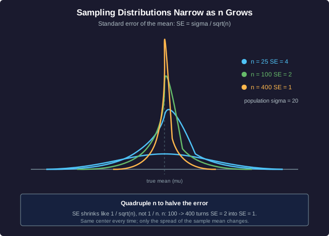
The curves above share one center and shrink in width as n climbs from 25 to 100 to 400, with sigma held at 20. Read off the SE at each: 4, then 2, then 1.
Compute the Standard Error
A population of test scores has standard deviation sigma = 20. You draw a sample of size n = 100 and compute its mean.
When the Axis Lies
Rigged Geometry
A chart is a geometric translation: numbers become lengths, areas, and slopes that the eye reads instantly. Rig the translation and the eye reports a lie the data never told.
Truncated axis. A bar chart should start its value axis at zero, so bar height stays proportional to value. Start the axis at, say, 95 instead of 0, and a rise from 100 to 102 (a real change of 2 percent) fills the frame as though it were enormous. The plotted lengths no longer match the ratios of the numbers. On a line chart the same trick steepens every slope: a gentle climb reads as a cliff because the vertical scale was compressed onto a narrow window.
Slope inflation. Slope is rise over run. Shrink the range the axis spans (the run of values it shows) while keeping the pixel height fixed, and every rise is redrawn steeper. The trend has not changed; only the geometry of the frame has.
Area-versus-length distortion. To show a quantity doubling, an honest chart doubles ONE dimension: a bar twice as tall. A dishonest one scales an icon or a circle in BOTH width and height, so a 2x value becomes a picture with 4x the area. The eye judges area, so a doubling looks like a quadrupling. Bubble charts abuse this constantly when they map value to radius instead of to area, since area grows as the radius squared.
The professional habit: check where the axis starts, check whether length or area encodes the value, and mentally rescale before trusting the shape.
Diagnose the Distortion
A dashboard shows quarterly revenue rising from 100 to 104 million. To make the gain look dramatic, the designer starts the vertical axis at 98 instead of 0. A second panel represents the same 4 percent gain by drawing a money-bag icon scaled up 4 percent in BOTH width and height.
The Shape, the Spread, the Error, the Axis
Bringing It Home
Automated dashboards draw the shape for you. They render the bars, fit the curve, animate the trend. What they cannot do is read the geometry with judgment. That is the professional's job.
A trained reader runs four checks on any chart:
- Centroid. Where does the shape balance, and is a skew dragging the mean away from the median? A single reported average can hide a lopsided reality.
- Spread. How wide is the shape? A confident-looking average built on huge variance is a coin flip in a suit.
- Sampling error. How big was n? The estimate carries a standard error of sigma/sqrt(n), and a tiny sample means a wide, untrustworthy interval no matter how crisp the headline number looks.
- Axis geometry. Does the value axis start at zero? Is the quantity encoded as length or as area? A rigged axis turns a rounding error into a revolution.
The dashboard supplies the picture. You supply the distrust. A chart whose axis geometry is rigged, or whose sample is too small, earns skepticism no matter how polished it looks.
Read This Dashboard
A startup's dashboard proclaims: average revenue per user JUMPED this quarter. The fine print: the average comes from a sample of n = 9 users, two of whom are enormous enterprise accounts, and the bar chart's axis starts at 90 percent of last quarter's value.
Geometry of Statistics: Summary
What You Have Learned
Statistics is geometry wearing numbers:
- The mean is a centroid: the balance point of the data. Skew pulls that pivot toward the long tail, so a right-skewed shape has mean > median. The median only counts positions, so it resists the pull.
- Standard deviation is spread: the typical distance from center, the width of the shape. Two distributions can share a mean yet differ wildly in how far their values scatter.
- Sampling error is sigma/sqrt(n): the width of the sampling distribution. It shrinks like 1/sqrt(n), so halving your error costs a fourfold sample. Precision is bought by the square root.
- Axis geometry can lie: a truncated axis unhitches length from value and steepens slope; scaling an icon in two dimensions grows area as the square of the factor, so the eye reads a doubling as a quadrupling.
Automated dashboards draw the shape. The professional reads it: locating the centroid, gauging the spread, weighing the sampling error, and distrusting any chart whose axis geometry is rigged. The picture is the floor; judgment is the ceiling.